

Luminous Laser - Responsive Website Redesign
Overview: Luminous Laser is a premium medspa offering advanced skincare and laser treatments. I redesigned their website to reflect the quality of the in-person experience, simplify navigation, showcase results, and improve trust and credibility while making booking effortless.
Role: Sole Product Designer, Researcher, Brand Designer
Tools: Figma, FigJam
Duration: 6 weeks
A premium service was being held back by an outdated digital presence
Luminous Laser is a premium medspa offering advanced skincare and laser treatments, but their website didn’t reflect the quality of the in-person experience. It felt cluttered, hard to navigate, and failed to build trust or clearly communicate results.
To uncover what wasn’t working, I researched clients experiences and reviewed competitors
I combined several approaches to get a clear picture of where the site was falling short. I conducted a content audit of the existing site to evaluate clarity, navigation, and booking flow. I also interviewed both current and potential clients to learn how they looked for treatments, built trust, and decided to book. Finally, I reviewed competitor medspa websites to identify best practices for communicating results and simplifying booking.
Confusing and cluttered Navigation

Unclear and Cluttered Structure

Outdated aesthetic

From this research, four key issues stood out:
1
Users wanted simple, clear information supported by visible proof of results.
2
Cluttered layouts and confusing navigation caused hesitation, and anything that slowed down booking risked losing appointments.
3
Non-clients often said the site felt “low budget,” and even loyal clients admitted they leaned on word-of-mouth or reviews, since the website didn’t match the quality of the in-person experience.
4
All users expressed frustration with having to call to book, and the site’s lack of a clear call-to-action made the process feel clunky.
These insights made it clear that the site needed a clean, professional, and consistent design that builds credibility, showcases results, and simplifies booking.
The research defined the opportunity: design for trust, clarity, and effortless booking
Research showed that both new and returning clients wanted the same things from the Luminous Laser website:
1. A professional look that built trust.
2. Clear, simple navigation to find treatments and pricing.
3. A frictionless booking option that didn’t require calling.
The redesign needed to feel clean, professional, and trustworthy. It had to clearly explain treatments, simplify navigation, make booking effortless with clear calls to action, and use high-quality visuals to showcase the spa’s premium services.
How Might We
To capture this challenge, I framed the problem as a How Might We:
How might we create a modern, luxury-focused design that builds trust and reflects the premium nature of the treatments, so new clients feel confident booking and existing clients feel valued?
Sitemap

Answering this question started with simplifying the foundation of the site. I created a site map to map out a clear structure: Home, Services, Pricing, About, and Book. This became the foundation for the redesign.
Translating trust and clarity into the new site design
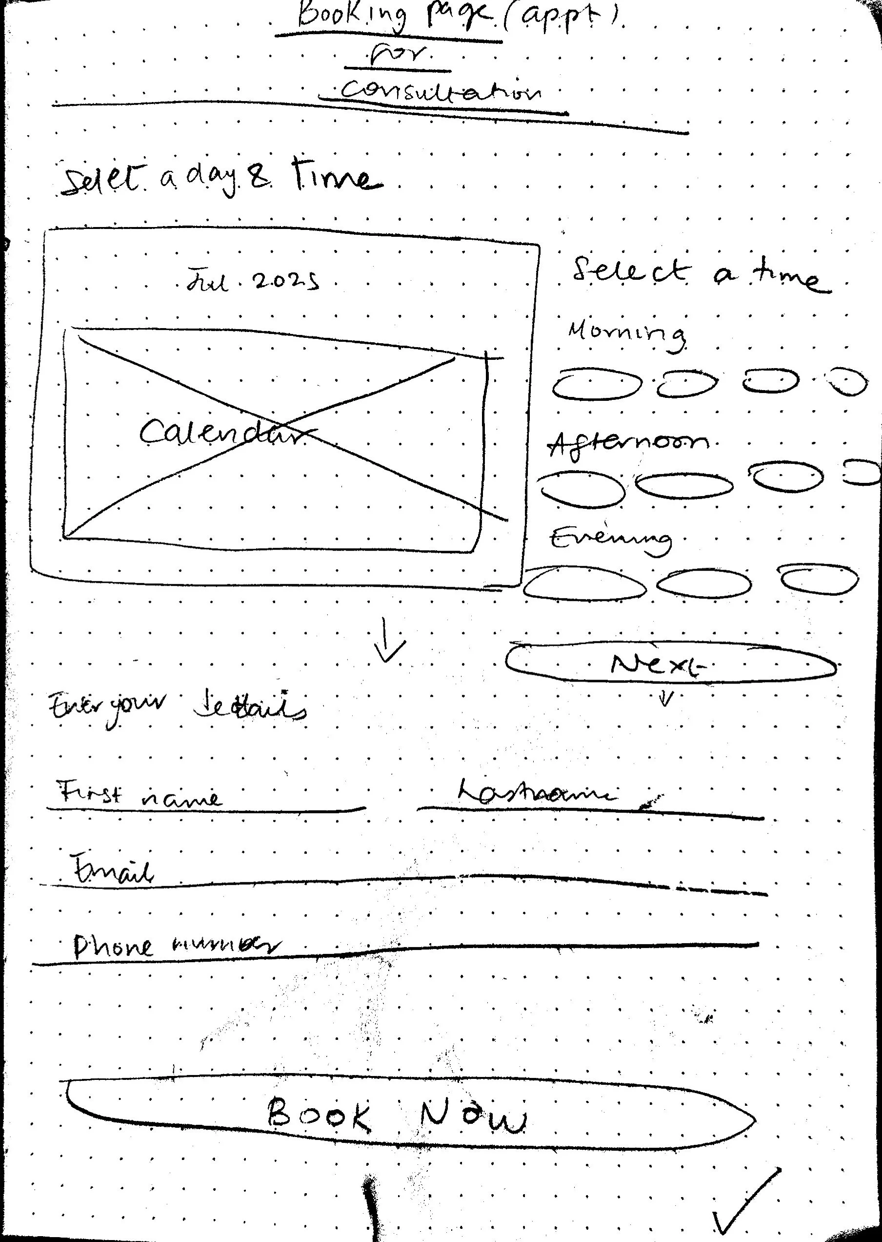
Low Fidelity Wireframes
With a clearer structure in place, I moved into design. My goal was to create a site that felt as polished and trustworthy as the in-person spa experience: calm, modern, and easy to use. I started with low-fidelity wireframes to test hierarchy, structure, and placement.

High Fidelity Wireframes
Once the structure felt solid, I built out high-fidelity designs with a refreshed brand identity:
A new logo and clean, modern typography
Neutral tones with subtle accents to convey calm and premium quality
Updated high quality imagery to showcase treatments
A consistent call-to-action to “Book Now” across key pages
Homepage
On the homepage, I added two trust-building sections. The first, “Why Choose Luminous Laser,” highlighted differentiators such as being women-owned, using modern technology, and offering transparent pricing. The second, “Why People Love Luminous Laser,” featured client reviews to provide social proof. In testing, participants described the homepage as “professional” and “inviting.” They consistently noticed the booking button, but wanted navigation text to be larger and more prominent. I refined the navigation to make it easier to scan, reinforcing both usability and trust.
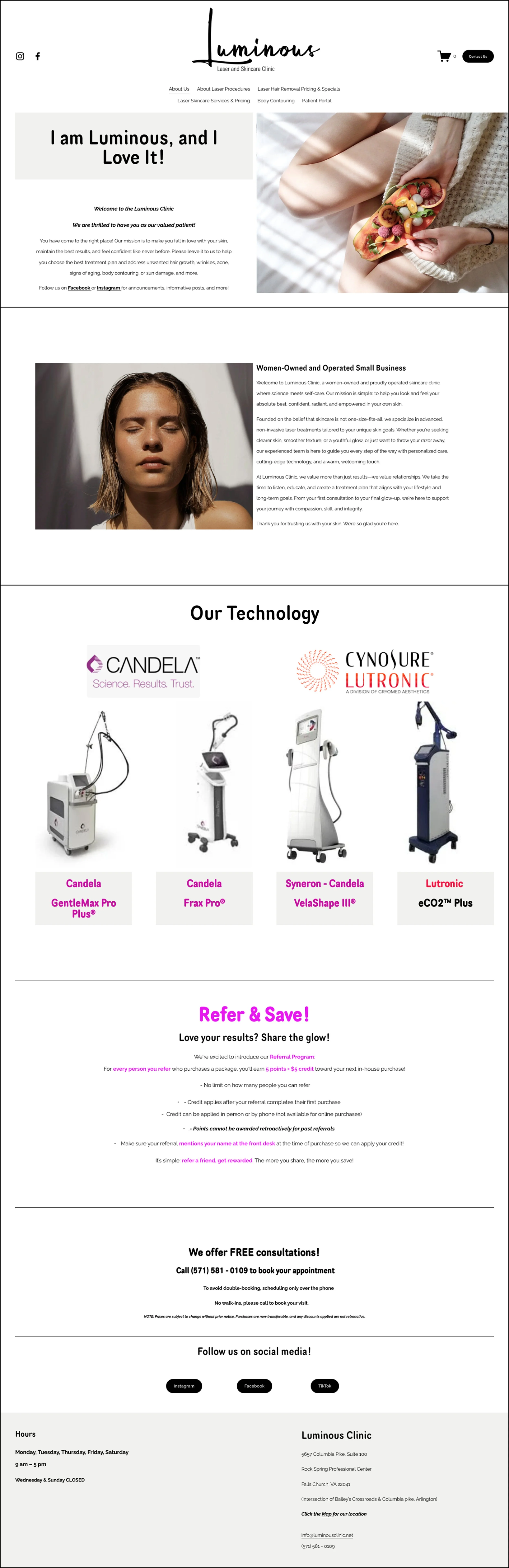
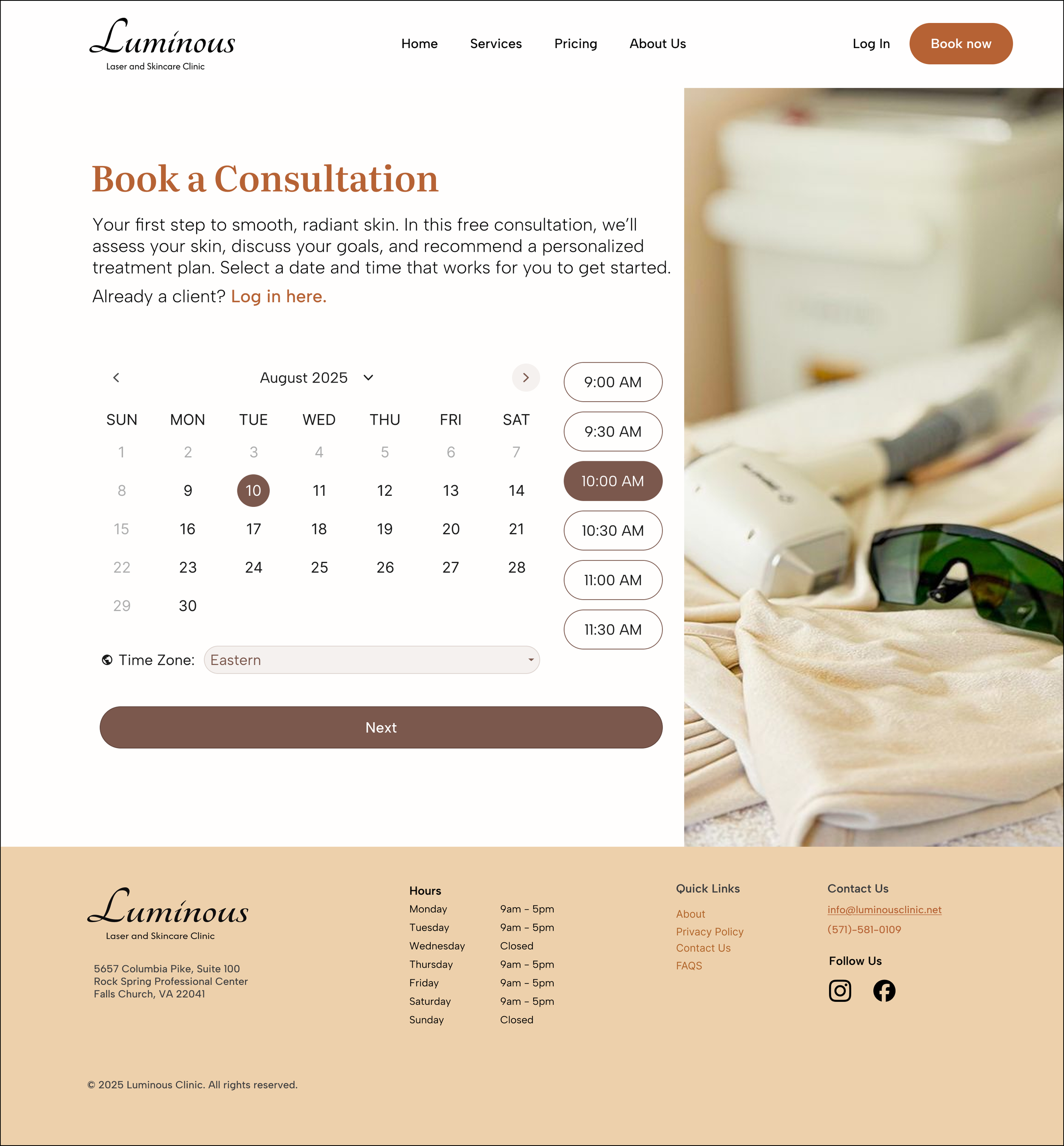
Before
After

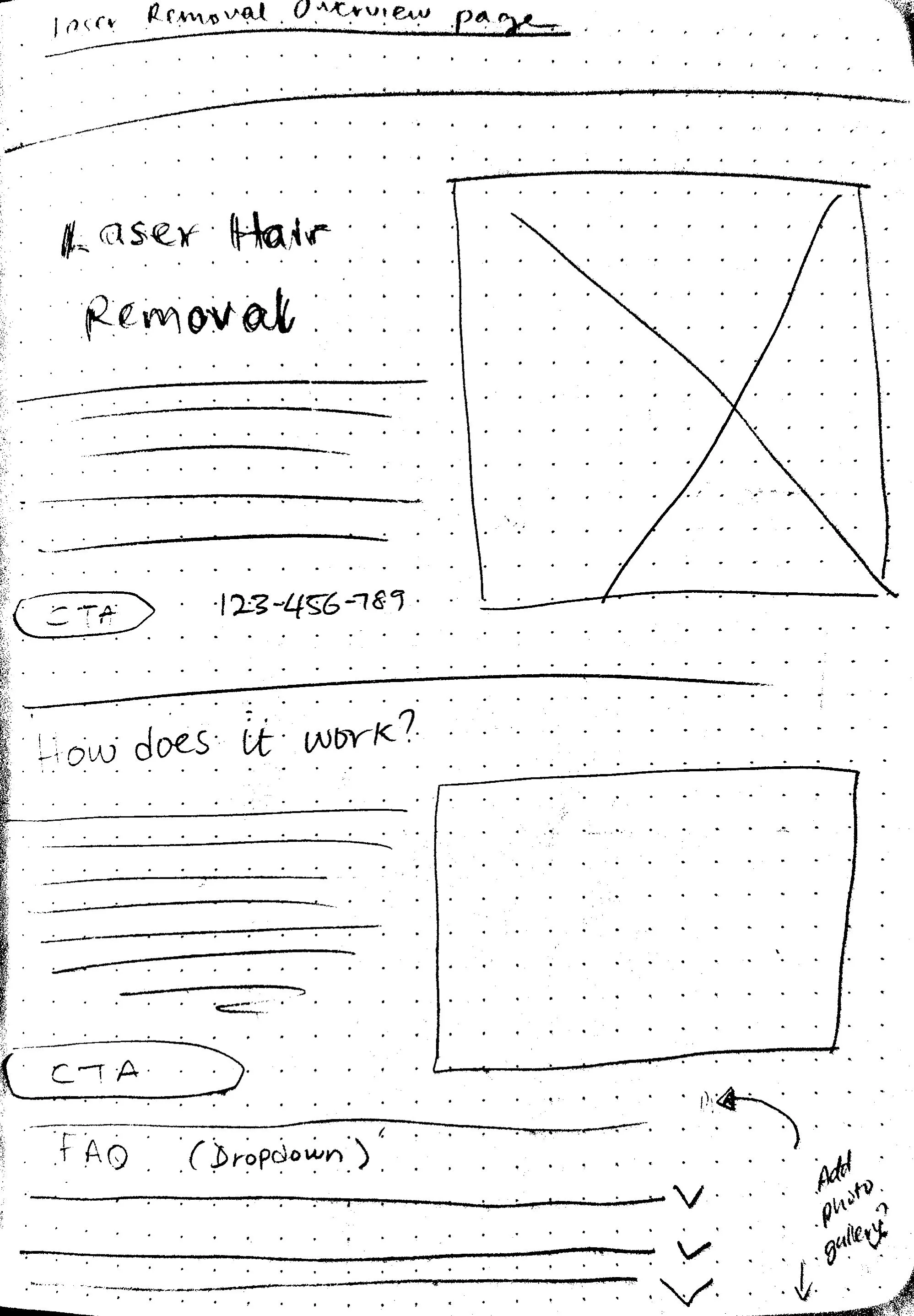
For the overview page, I added a structured FAQ, prep instructions, and treatment details to help first-time clients feel informed and confident. Testing confirmed the dropdown FAQ format made information easier to process, especially for new visitors.
Feedback also revealed areas to refine: headings were sometimes vague, users wanted clearer pre- and post-treatment guidance, and many asked for direct links to pricing and treatment areas. I updated the content to use plain language, expanded the guidance, and added those links, turning the overview page into both an educational and reassuring entry point for clients.
Laser Hair Removal Overview Page

Overview page After
Overview page Before

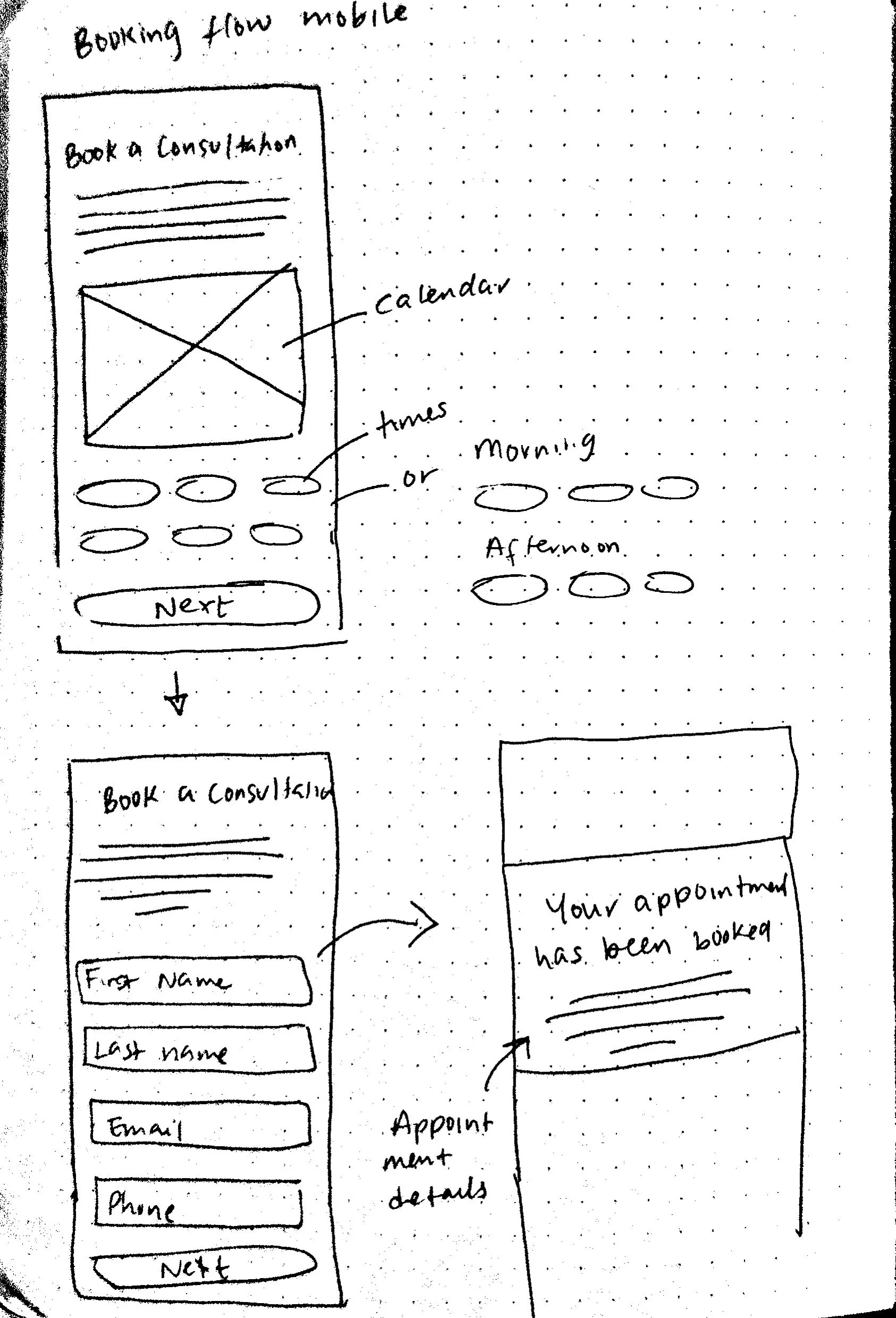
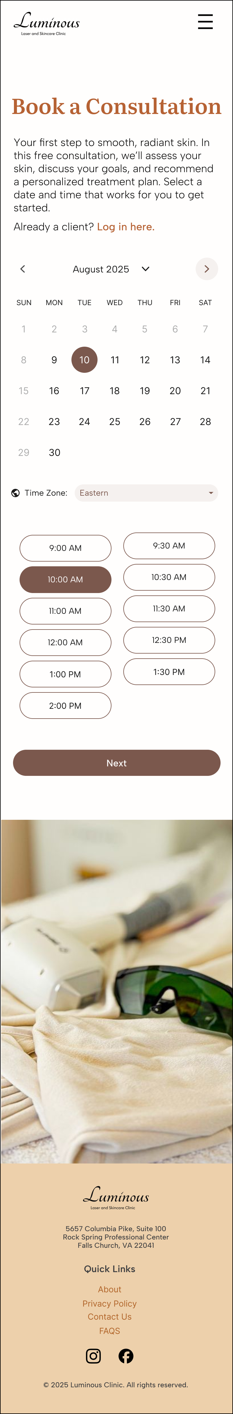
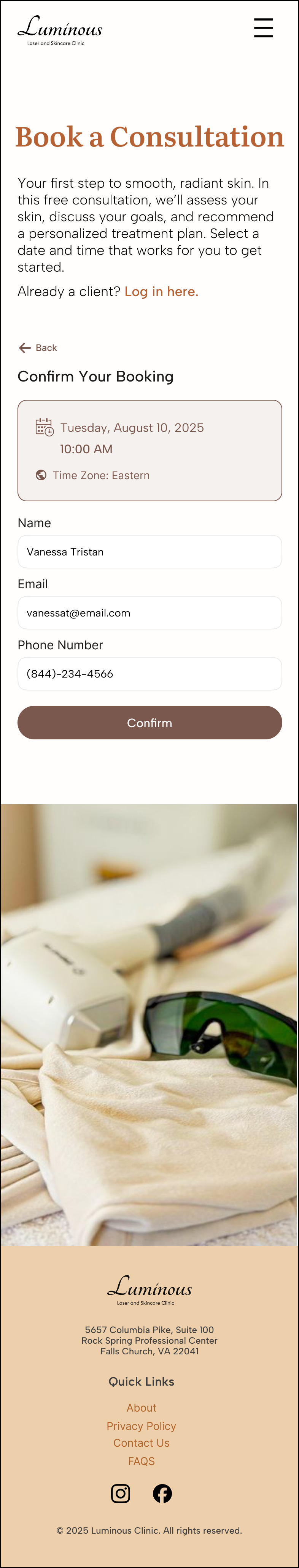
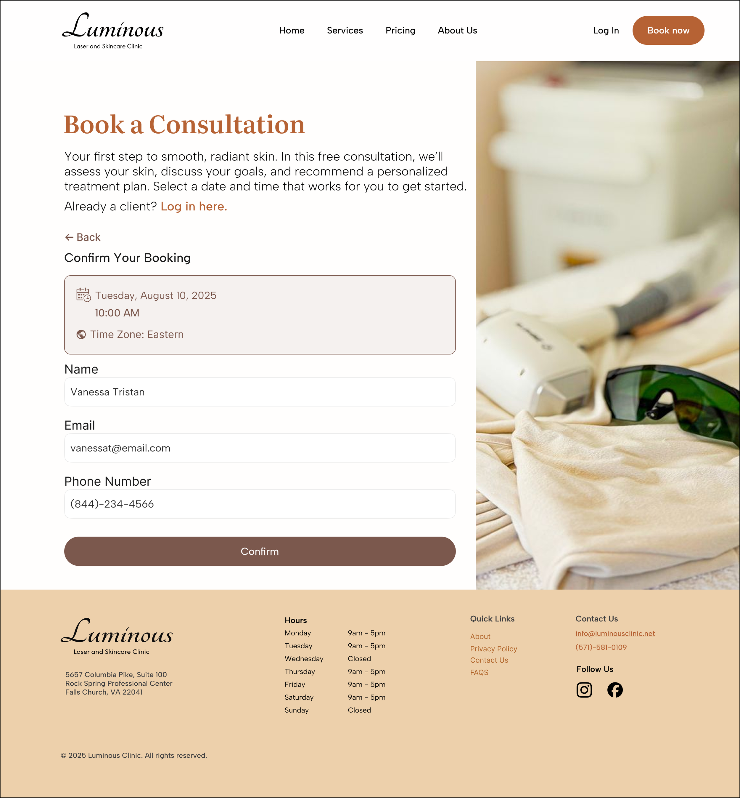
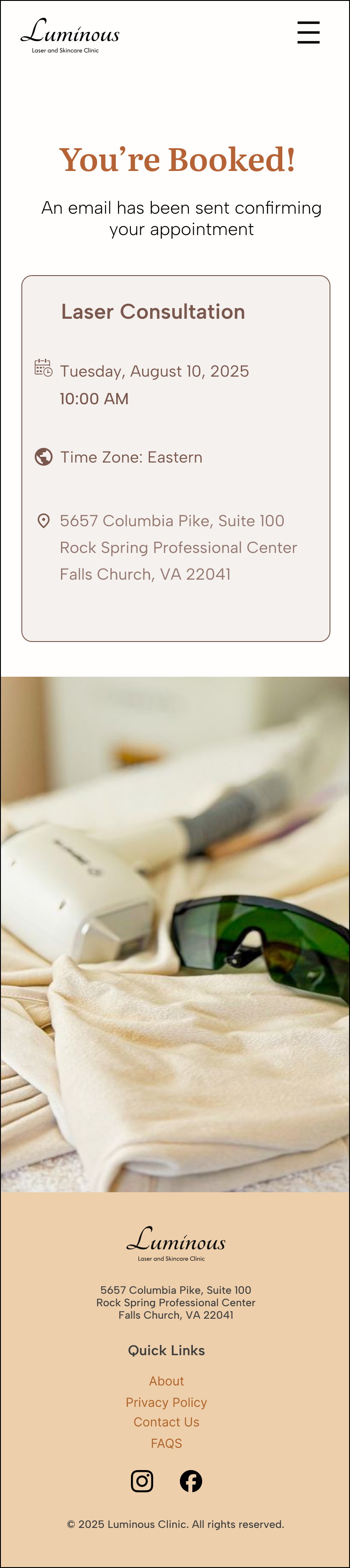
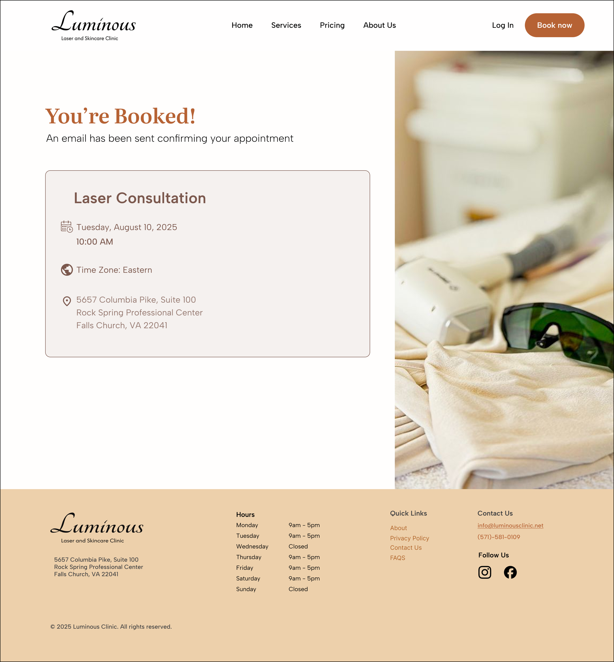
Booking Flow
I designed a booking flow that let users choose a date and time, enter details, and receive instant confirmation. This gave clients the option to book online rather than having to call. Participants preferred the new flow and described it as quick and intuitive. Some still valued the ability to call, so I made sure both options were available.
Together, these updates shaped a site that felt modern, credible, and seamless to use. The design now reflected the professionalism of the spa itself and built trust from the very first click.
What this project taught me about designing for trust
The redesign transformed Luminous Laser’s site from outdated and untrustworthy into a clean, modern, and credible experience. Both new and returning clients now encounter a digital presence that mirrors the quality of the spa, with a streamlined structure and booking flow that lowers barriers to conversion.
My biggest takeaway was how strongly design shapes trust. Long before clients step into the spa, the website sets their expectations. Aligning the digital and in-person experiences was key to building credibility and confidence.